/ Client
Power Climb
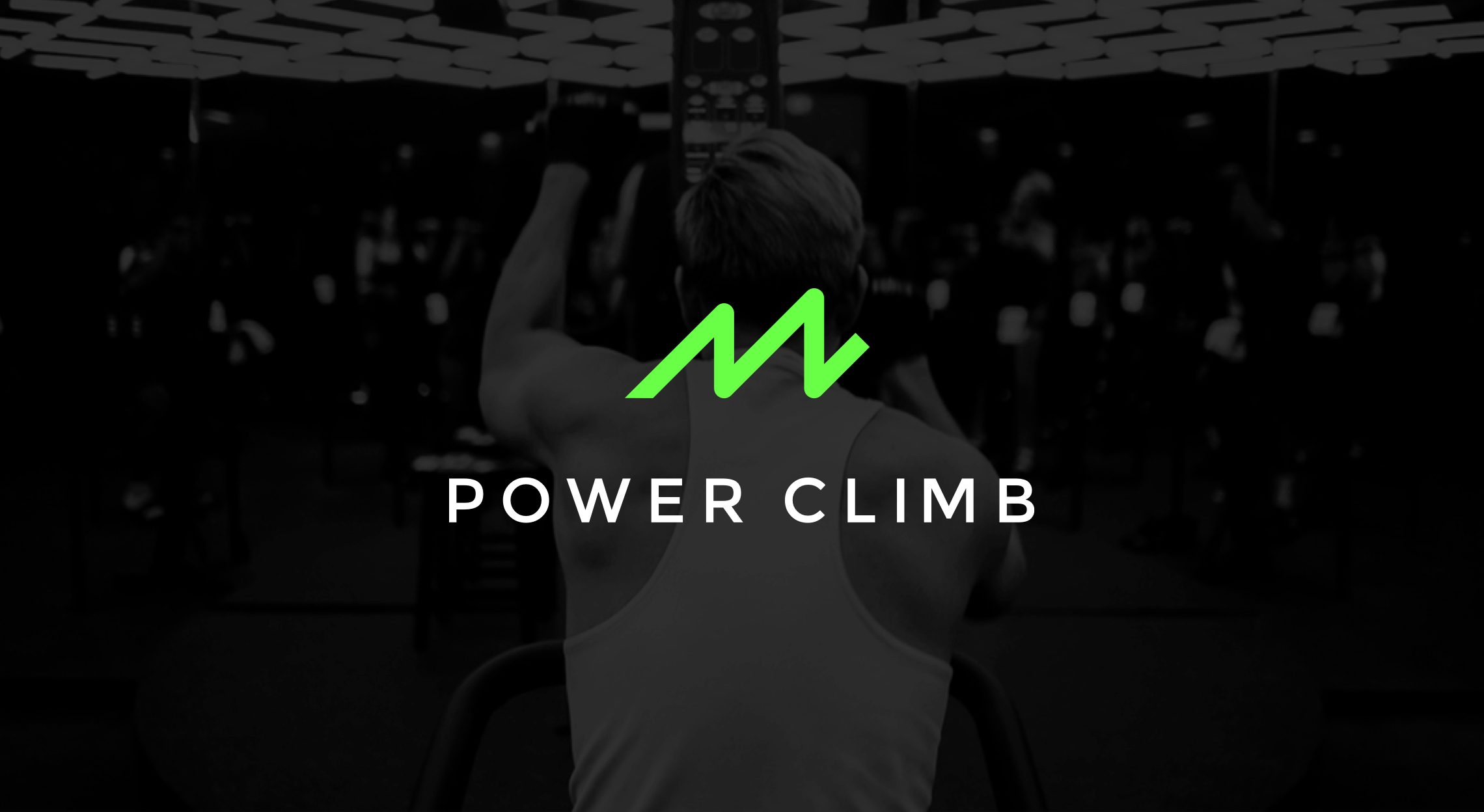
Power Climb is a fitness studio specializing in versa climber workouts for the San Mateo community. They embrace personal connections between instructors, staff, and clients — aiming to create a community where all people are empowered through kindness and strength.
We worked closely with their team to create a brand identity and design system that supports this vision — from wordmark and iconography to apparel, environment, and the voice that ties it together.
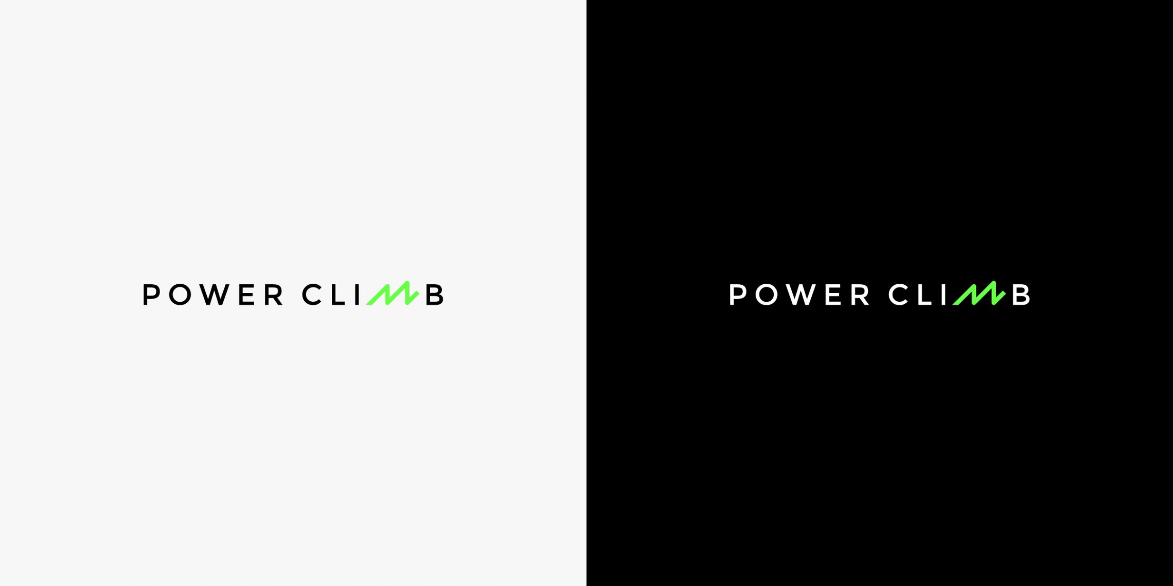
The wordmark hides a climbing peak inside the letterforms — a quiet nod to the versa climber motion the studio is built around. One mark, two surfaces: a bright daytime version and a confident after-dark counterpart.
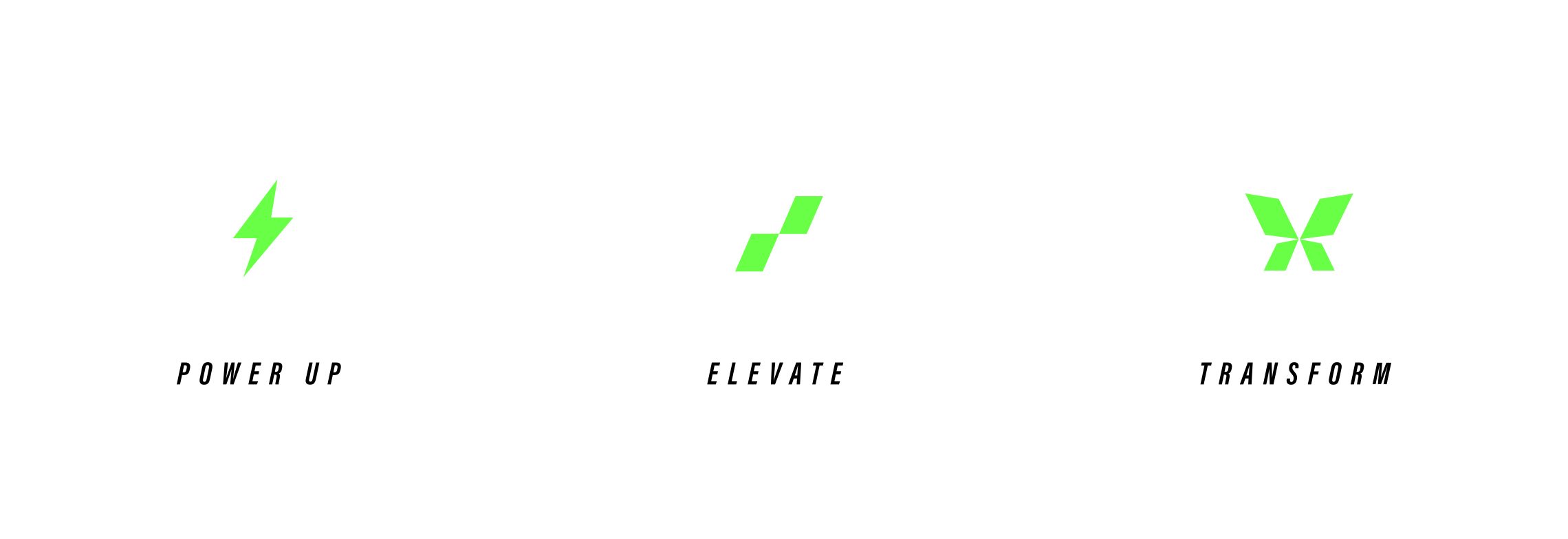
Three icons anchor the class system — Power Up, Elevate, and Transform — each mapped to an intensity and a stage of the member journey. Simple shapes, immediately legible on a schedule, a shirt, or a wall.
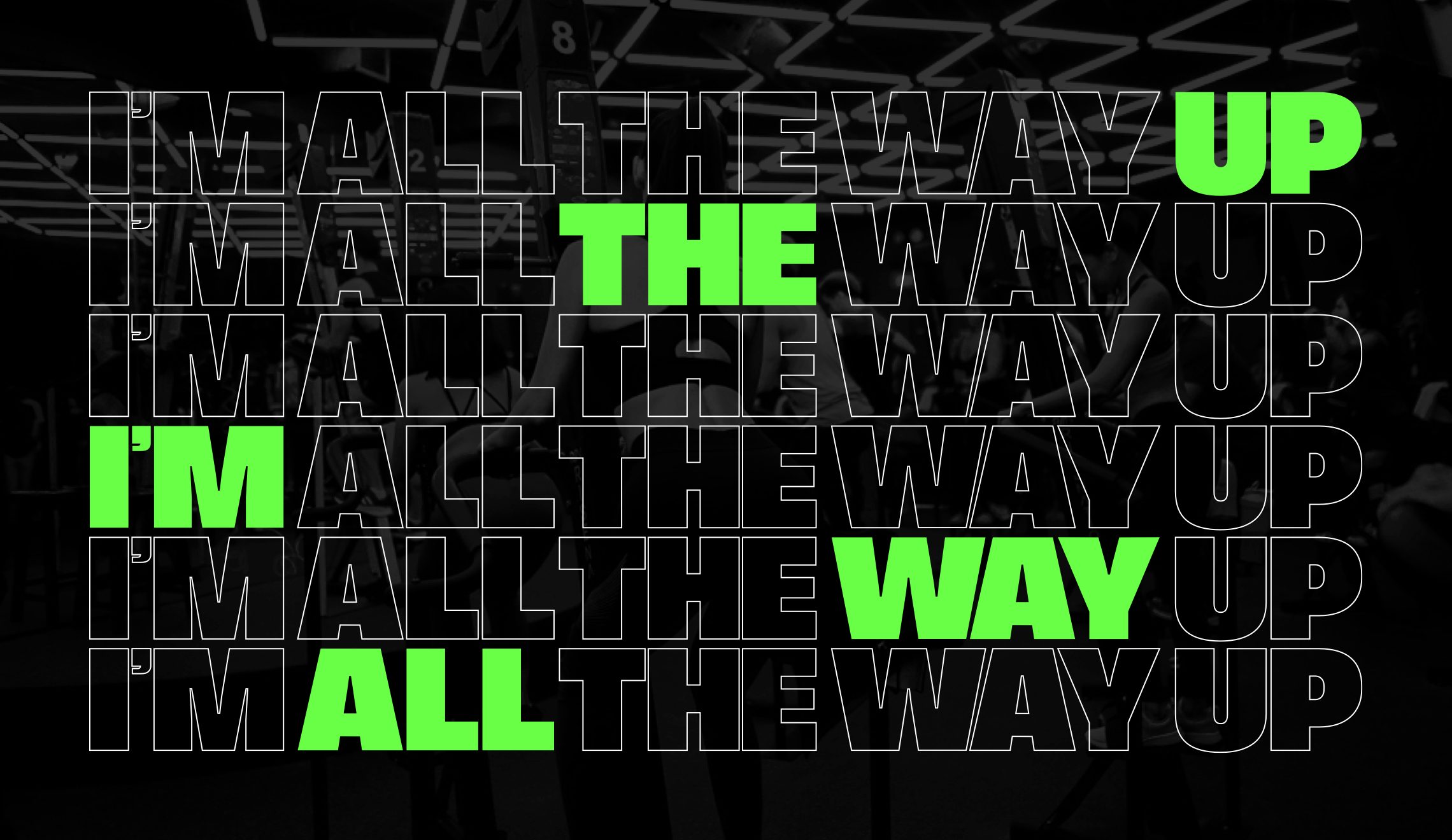
“I’m all the way up.” A campaign line that doubles as a member mantra — staggered, looped, and stamped across walls, posters, and social so it lands the same way every time.
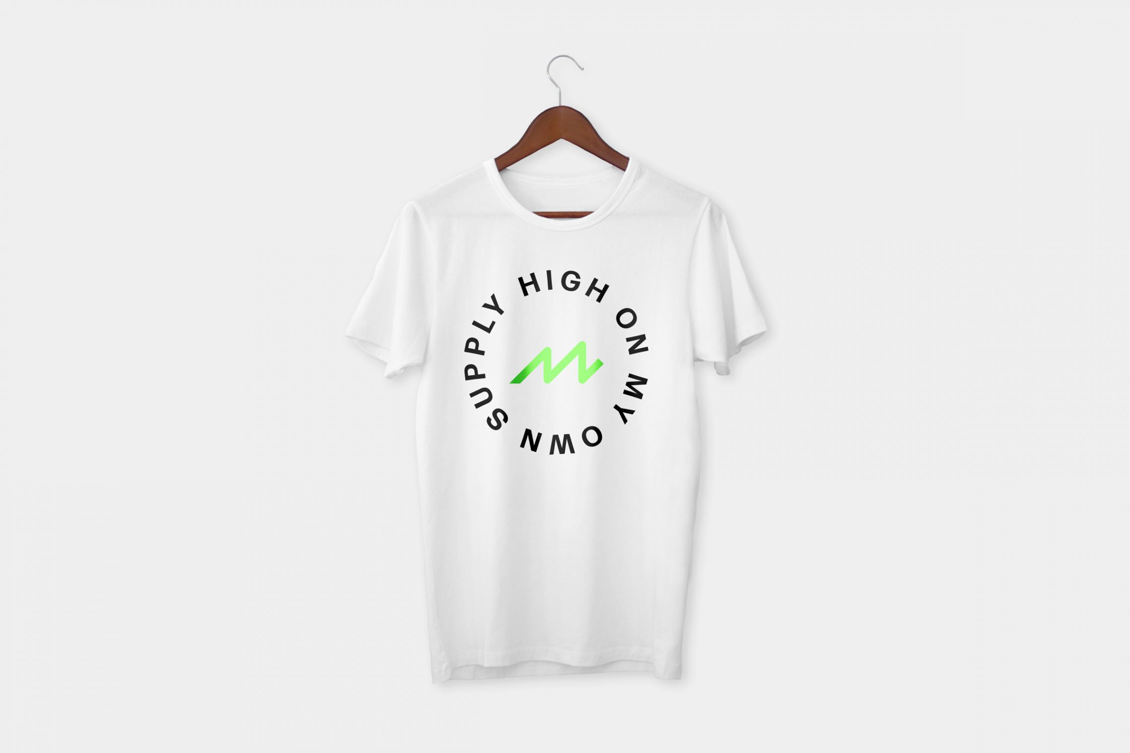
Merch is part of the system, not an afterthought — circular lockups for tees, badges for hats, and a tone of voice that gives members something they actually want to wear out of the studio.
The result
A complete identity system — wordmark, icons, apparel, environment, and voice — that gives Power Climb a single, durable brand for the community it’s building one class at a time.